Reading a Volcano Plot
A volcano plot helps you quickly find genes with both a large change and strong statistical evidence in differential-expression results. Each point represents one gene; points toward the upper right and upper left are the first candidates to inspect.
Strong statistical evidence ↑ Higher in Control ← No change → Higher in TreatmentThe two axes answer different questions
Section titled “The two axes answer different questions”The horizontal axis is log2FoldChange. Check the analysis contrast to determine which direction is positive.
log2FoldChange compresses how many times values differ
Section titled “log2FoldChange compresses how many times values differ”Suppose the comparison is defined as Treatment / Control. If a gene’s representative expression is 100 in Control and 200 in Treatment, Treatment is two times as high. Since log2(2) = 1, the log2FoldChange is +1.
| Control | Treatment | Treatment / Control | log2FoldChange | Interpretation |
|---|---|---|---|---|
| 100 | 100 | 1 | 0 | No change |
| 100 | 200 | 2 | +1 | 2 times higher in Treatment |
| 100 | 400 | 4 | +2 | 4 times higher in Treatment |
| 100 | 50 | 1/2 | -1 | Half as high in Treatment, 2 times higher in Control |
| 100 | 25 | 1/4 | -2 | One quarter as high in Treatment, 4 times higher in Control |
Using logarithms makes increases and decreases symmetric around 0. A twofold increase is +1 and a twofold decrease is -1, so the left and right sides of a volcano plot use the same scale.
The FoldChange in differential-expression results is not a simple ratio between two sample counts. Tools such as DESeq2 and PyDESeq2 estimate the condition effect using a statistical model that corrects for sequencing depth and incorporates design terms such as batch or paired subject. It may therefore differ from the direct ratio of two numbers in the original table.
The sign of log2FoldChange matters, but it does not indicate significance by itself. A value of +3 may have weak evidence if the direction varies greatly across replicates, while +0.3 may produce a small p-value if it is consistent across many replicates.
The vertical axis is usually -log10(padj). The smaller the padj, the higher the point. For example, padj=0.01 has a height of 2, while padj=0.0001 has a height of 4. Statistical Testing and Multiple Testing explains adjusted p-values.
You must read both axes together. A low point far to the right has a large effect size but may be inconsistent across samples. A high point near the centre may be consistent but have a small effect size.
Example: reading GSE251845 results
Section titled “Example: reading GSE251845 results”The plot below compares Tumour and Normal samples from the same patients in the public colorectal-cancer RNA-seq dataset GSE251845. The contrast is Tumour / Normal, so the right side contains genes higher in Tumour and the left side contains genes higher in Normal.
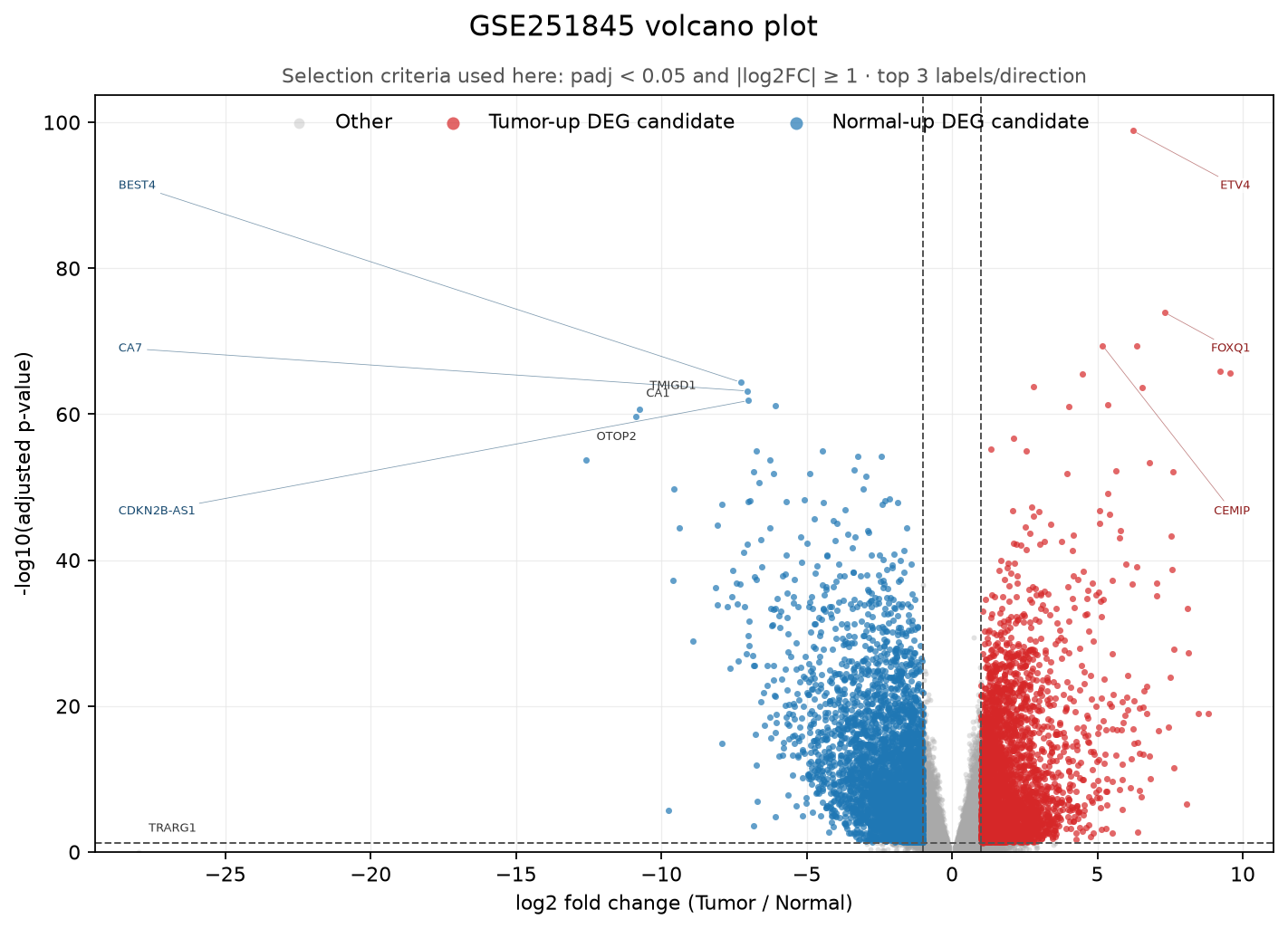
The red points on the right are genes at least two times higher in Tumour and still significant after multiple-testing correction. The blue points on the left are at least two times higher in Normal. Grey does not mean unimportant; it means the gene did not pass both thresholds chosen for this plot.
Lines are selection criteria, not discoveries
Section titled “Lines are selection criteria, not discoveries”Plots often draw lines at padj < 0.05 and |log2FC| ≥ 1. These lines are not boundaries of biological truth. They are criteria for controlling how many candidates move to follow-up review. With many samples, a small change can be highly significant; with few samples, even a large change may not be significant.
Set thresholds together with:
- The smallest effect size meaningful to the research question
- The sample count and within-group variation
- The number of candidates that can be checked in follow-up experiments
- Whether you plan to analyse pathways rather than individual genes
How is this different from an MA plot?
Section titled “How is this different from an MA plot?”Both plots use log2 fold change on one axis, but they emphasize different things.
| Plot | Other axis | What to check first |
|---|---|---|
| MA plot | Mean expression | How unstable effect sizes are at low counts |
| Volcano plot | Statistical significance | Where candidates satisfy both effect-size and statistical-evidence criteria |
An MA plot is useful for inspecting analysis quality and count dependence. A volcano plot is convenient for communicating candidate genes and discussing priorities. Neither replaces the other.
Conclusions to avoid
Section titled “Conclusions to avoid”- Do not conclude that a gene in the upper right causes the disease.
- Do not call every point with
padj < 0.05an important biomarker. - Do not infer that an entire pathway is active solely because one side has many points.
- Do not explain only a few hand-picked gene names; preserve the complete results table and selection criteria.
A volcano plot is a map for finding candidates. Causality, clinical value, and cell-type changes require independent data and further experiments. You can continue by analysing shared functions in the candidate list with Finding Shared Functions in a Gene List.