07. Finding Outlier Genes in One Sample
After RNA-seq produces an expression matrix, suppose you have only one expression vector from one patient. This lesson focuses on how to use public references to select genes with unusually extreme expression.
Goal of this note: Understand why an N=1 analysis needs a comparison baseline, what percentile, z-score, fold change, and maximum comparisons each tell you, and how far you can interpret the statement that “expression stands out.”
This resembles judging one production server from a single metric. CPU at 80% is not meaningful until you know the ordinary range for servers with the same role. Here, a sample’s gene-expression vector replaces the server-metric vector, and normal-tissue and cancer reference cohorts replace historical observations.
for gene in common_genes:    baseline = reference_samples[gene]    score[gene] = compare(patient_sample[gene], baseline)
candidates = rank(score)
The output of this pseudocode is a ranked list for further investigation, not a causal diagnosis.
1. What can one sample tell you?
Section titled “1. What can one sample tell you?”The available data are one RNA-seq profile from one patient’s tumor tissue: a single vector containing expression values, TPM or raw counts, for tens of thousands of genes, about 60,000 depending on the annotation.
As a DataFrame, rows are genes, columns are samples, and values are expression. One patient contributes one column, while reference values for the same gene form a distribution across the other columns.
| gene | patient | normal_001 | normal_002 | cancer_001 | … |
|---|---|---|---|---|---|
MDM2 | 1235.72 | 4.10 | 5.32 | 12.80 | … |
ACTB | 850.31 | 790.20 | 910.44 | 822.17 | … |
So, which values matter? You cannot inspect 60,000 expression rows by eye. The problem narrows to one question:
“In this tumor, which genes have unusually extreme expression compared with normal tissue or other cancers?”
Answering this question is outlier-gene detection.
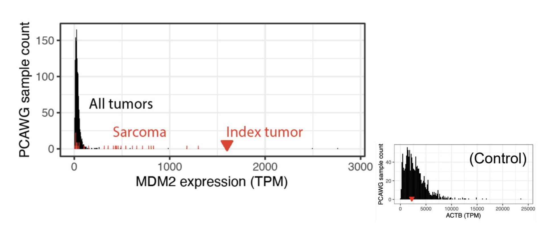
The idea. The horizontal axis is one gene’s expression in TPM, and the vertical axis is the number of samples with that expression. MDM2 is low in most tumors, labeled All tumors, while this patient’s Index tumor lies far to the right. It stands out even among Sarcoma samples. In the smaller panel on the right, the housekeeping gene ACTB is high in everyone and lies near the center of the distribution. It is not an outlier.
An outlier is not automatically a cause
Section titled “An outlier is not automatically a cause”Even after finding unusually high expression, that alone does not show that the gene caused the cancer. High expression can have any of the following roles:
| Role | Meaning |
|---|---|
| Cause | Directly contributes to tumor initiation or progression |
| Consequence | Increases secondarily when a tumor-related pathway turns on |
| State | Changes as the tumor adapts to its microenvironment, such as hypoxia, nutrient deprivation, or acquisition of metastatic ability |
The only firm conclusion from the current data is that the expression is an outlier. Establishing causality requires these forms of evidence together:
WGS variant analysis + pathway analysis + literature review. For example, distinguish whether overexpression arises from a variant in the gene itself or from another regulatory gene despite no variant in the gene. In the second case, interrupting that regulatory link might become a hypothesis. Add other omics layers, such as ATAC-seq, which measures open sites where transcription factors and enzymes can bind, to check the mechanism layer by layer.
Outlier detection remains useful because it selects genes with clear changes relative to normal tissue and other patients as a starting point for targeted-treatment and drug-candidate searches, as in the MDM2 overexpression targeted in Sid’s case.
2. Comparison baseline: reference data and validation
Section titled “2. Comparison baseline: reference data and validation”Comparing one sample requires public reference data as a baseline. We used two readily downloadable, TPM-level datasets from the same families used by Sid.
| Reference | Scale | Type |
|---|---|---|
| GTEx | 74,628 genes, 19,616 samples, 31 tissues | Normal-tissue expression |
| PCAWG, via EBI | 56,717 genes, 1,350 samples, 27 cancer types | Expression in other cancer patients |
The comparison retained only the 45,698 genes shared by all three datasets, my sample, GTEx, and PCAWG.
This intersection aligns the keys for a table join. Datasets can use different gene-ID versions and include different genes. Joining by names without harmonizing them can compare different entities or create many missing values. Match the gene-ID system, annotation version, expression unit, and preprocessing first.
🧩 The figures use PCAWG data downloaded from the Expression Atlas of the European Bioinformatics Institute (EBI) as the cancer reference, so tables and plots label it
ebi. It belongs to the same PCAWG family described in Sid’s case.
Validation 1: Boston versus Tempus correlation
Section titled “Validation 1: Boston versus Tempus correlation”Before the main analysis, first ask whether the counts are trustworthy. The same specimen was sent to two companies, so their expression values should have similar distributions.
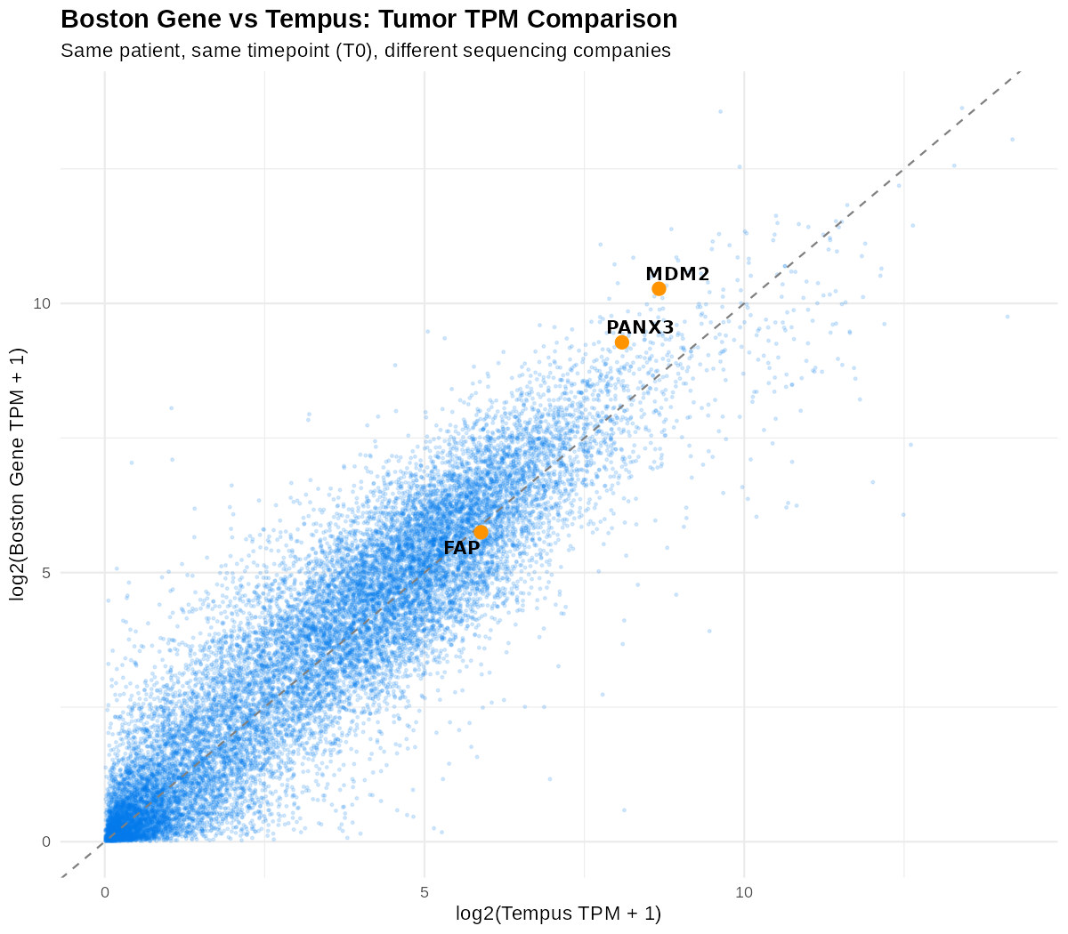
A log2(TPM+1) scatter plot of sequencing results from two companies for the same patient at the same time point, T0. The points do not form a perfect line, but their strong diagonal correlation confirms that expression quantification was produced reproducibly. Distributions and summary statistics explains correlation and log transformation.
Validation 2: do previously known genes actually stand out?
Section titled “Validation 2: do previously known genes actually stand out?”Next, check whether genes explicitly identified as disease-related in Sid’s case show the same outlier pattern in the data.
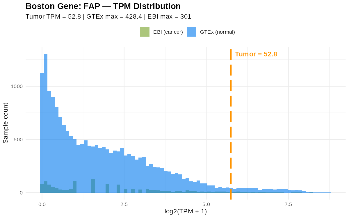
Each plot corresponds to one gene. The horizontal axis is log2(TPM+1), and the vertical axis is the number of samples. Blue is the GTEx normal distribution, green is the EBI cancer distribution, and the orange dashed line is my tumor value. FAP was originally identified from single-cell data, so its total-RNA signal is not especially prominent, although it still lies toward overexpression. Other genes named as major targets fall far outside the distributions.
How to read the plot: expression in most samples clusters near the center of the histogram. The degree to which my sample, the orange line, moves right of that center is how strongly it stands out. This is the same format Sid used in his public viewer.
3. Metrics for selecting outliers
Section titled “3. Metrics for selecting outliers”You cannot inspect 45,000 genes by eye, so you need numeric metrics that select outliers. We use four comparisons between tumor TPM and a reference distribution.
Each metric is a different sort key. Percentile describes position within a distribution, z-score gives standardized distance from the mean, fold change gives a ratio to a baseline, and maximum comparison asks whether the value exceeds the observed range. Use several columns together instead of treating one as the answer.
| Metric | What it measures | Example criterion |
|---|---|---|
| Percentile rank | What top percentage the sample’s TPM occupies in the reference distribution | Maximum, top 1%, top 5%, and so on |
| Z-score | How many standard deviations from the reference mean the value lies | ∣Z∣ ≥ 2 |
| Fold change | How many times the reference median the value is | log2FC ≥ 2, at least 4-fold |
| Maximum comparison | Whether the tumor exceeds even the largest value observed in normal samples | True / False, direct comparison |
A z-score is the number of reference standard deviations between a value and the reference mean. Fold change describes a multiplicative difference from the baseline: log2FC 2 is 4-fold, and log2FC 9 is 512-fold. See Distributions and summary statistics for the calculations and limitations of percentiles, means, medians, standard deviations, and log transforms.
The maximum comparison is not a widely standardized metric from the literature. It is a direct comparison used to reproduce Sid’s case, recorded as True or False for the question, “Does this value exceed even the largest value observed in normal tissue?”
Actual calculations for known target genes
Section titled “Actual calculations for known target genes”The following table shows part of the result calculated from the EBI/PCAWG cancer reference. ebi_median and ebi_max are the median and maximum expression values for that gene across about 1,350 cancer patients.
| gene | tumor TPM | ebi median | ebi max | z-score | log2FC | ≈ fold |
|---|---|---|---|---|---|---|
| PANX3 | 619.43 | 0.138 | 19.84 | 9.14 | ≈ 560× | |
| MDM2 | 1235.72 | 4.954 | 2731 | 4.47 | 5.32 | ≈ 40× |
| FAP | 52.76 | 2.0 | 301 | 1.97 | 3.75 | ≈ 13× |
- For
PANX3, the median among cancer patients is 0.138, while the tumor is 619.43. It exceeds even the maximum by percentile, has a z-score of 19.84, nearly 20 standard deviations from the mean, and is expressed about 560-fold above the median, log2FC 9.14. This is a textbook outlier. MDM2is a gene Sid actually targeted. Its tumor TPM is 1235.72, while the public viewer displays a value around 1500.FAPhas a relatively weaker signal, z ≈ 2. This agrees with its role as a target detected in single-cell data that does not stand out in total RNA.
Initial filter: twice the normal or cancer maximum
Section titled “Initial filter: twice the normal or cancer maximum”Combine several metrics to narrow the candidates. For example, plot tumor TPM directly against maximum EBI cancer TPM, with a diagonal y=x line and a two-fold line, +1 in log2 units.
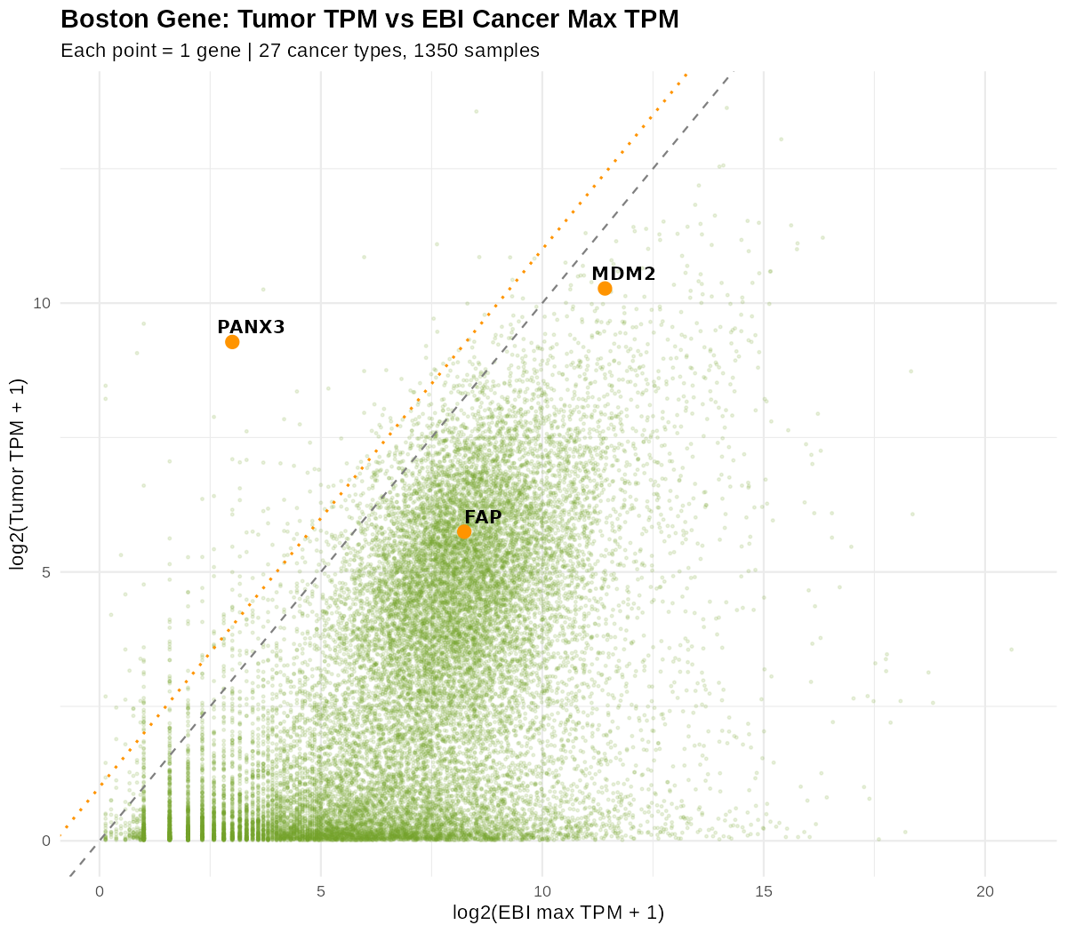
Each point is one gene, compared with the maximum across 27 cancer types and 1,350 samples. The diagonal, y=x, means “equal to the cancer maximum,” and the upper dashed line marks two-fold. Genes such as PANX3 and MDM2 that lie above the two-fold line are initial outlier candidates. A maximum-based comparison does not make every tumor-only signal perfectly separate because samples vary, so use several metrics together.
This approach selects genes at least two-fold above the reference maximum or median as initial outliers. You can rank with one metric or combine several.
Summary
Section titled “Summary”One sample’s value cannot say high or low by itself. Place it within the distribution of the same gene in normal tissues and other cancers, then measure the distance.
One expression-matrix column → select shared genes → compare with reference distributions → rank candidates by percentile, z-score, and fold change
An outlier is a candidate for further investigation, not a conclusion that a gene caused the cancer or is a treatment target. Next, Finding shared functions in a gene list interprets which functions are concentrated among candidate genes.
Sources
Section titled “Sources”- Alignment tools: STAR, Samtools
- Quantification: RSEM, featureCounts (Subread)
- Normal-tissue expression reference: GTEx Portal
- Cancer-expression reference: PCAWG (Nature 2020), EBI Expression Atlas
- Functional enrichment analysis: g:Profiler, NetworkAnalyst
- Sid’s public expression viewer: osteosarc.com/rnaseq