LOCRC Exercise 1: From Raw Counts to DEG Candidates
1. What you will practice
Section titled “1. What you will practice”This exercise answers one question.
When colorectal tumor and adjacent normal tissue from the same patient are compared, which genes show consistent expression differences?
Genes whose expression differs consistently between two conditions are called differentially expressed genes, or DEGs. This exercise statistically tests whether the Tumor-versus-Normal difference recurs across 22 patients and identifies DEGs.
The dataset is GSE251845 from NCBI GEO. It contains 44 RNA-seq samples: one tumor and one adjacent normal tissue sample from each of 22 patients diagnosed with late-onset colorectal cancer (LOCRC) after age 50. Instead of processing FASTQ again, the analysis starts from HTSeq raw counts provided by GEO.
LOCRC is not a separate pathological diagnosis or cancer type. It is a research and epidemiological term that divides colorectal-cancer patients by age at diagnosis. It is commonly contrasted with early-onset colorectal cancer diagnosed before age 50, although the exact cutoff must be checked for each study. The original GSE251845 paper separated groups diagnosed before age 50 and after age 50.
What is colorectal cancer tissue?
Section titled “What is colorectal cancer tissue?”“Colorectal” includes both the colon and rectum. Colorectal cancer tissue is obtained by surgery or biopsy from a tumor in either location. In GSE251845, RNA was extracted from surgically resected colorectal tumors and adjacent non-tumor tissue from the same patients.
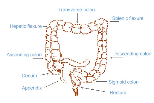
The large intestine begins at the cecum, continues through the ascending, transverse, descending, and sigmoid colon, and connects to the rectum below. Cancers in the colon and rectum are collectively called colorectal cancer. Sources: US National Cancer Institute SEER colorectal anatomy material and public-domain file information on Wikimedia Commons.

The diagram shows the anatomical locations where tumors arise. RNA-seq does not measure the entire organ in the diagram. It measures a small piece of tissue removed from the operated colon. Interpreting counts therefore requires knowing which cells were present in that piece.
Cancer cells were not isolated from the C samples in GSE251845. Along with malignant epithelial cells, they contain immune cells, fibroblasts, vascular cells, and remaining normal epithelial cells. Bulk RNA-seq measures RNA from all these cells together, so the DEGs in this exercise describe changes in colorectal tumor tissue as a whole, not changes in cancer cells alone.
For example, if an immune-related gene increases in Tumor, bulk RNA-seq alone cannot distinguish whether cancer cells expressed more of the gene or whether the proportion of immune cells in the tissue increased. Tumor and adjacent normal tissue explains this limitation of tissue composition and why adjacent normal tissue is used as a control.
What does the dataset look like?
Section titled “What does the dataset look like?”Opening the file reveals a large table of gene names, sample names, and integer counts. The table below contains only the first five genes and columns from the first two patients in the real GSE251845_htseq_raw_counts.csv.gz file.
| gene ID | 24C_htseq.out | 24N_htseq.out | 27C_htseq.out | 27N_htseq.out |
|---|---|---|---|---|
ENSG00000000003 | 9,896 | 6,279 | 5,653 | 4,198 |
ENSG00000000005 | 32 | 49 | 40 | 43 |
ENSG00000000419 | 5,129 | 2,406 | 3,549 | 2,052 |
ENSG00000000457 | 929 | 1,288 | 522 | 649 |
ENSG00000000460 | 952 | 315 | 191 | 182 |
The row name ENSG00000000003 is an Ensembl gene ID. In each column name, 24 is the patient number, C means cancer tissue, and N means adjacent normal tissue from the same patient. _htseq.out comes from the HTSeq output filename and is removed when creating metadata.
The first value, 9,896, means that 9,896 RNA-seq fragments were assigned to ENSG00000000003 in patient 24’s tumor tissue. The adjacent 6,279 is the value observed in adjacent normal tissue from the same patient.
Because the table shows only the first five gene rows, __no_feature is not visible. Non-gene summary counters such as __no_feature and __ambiguous are at the end of the real file. The HTSeq raw-count reference explains each row and why these counters are separated before analysis.
From raw count to DEG
Section titled “From raw count to DEG”9,896 ÷ 6,279 is about 1.58, so Tumor appears higher for this patient. This one ratio is not enough to call the gene a DEG.
First, the total number of RNA-seq fragments read differs among samples. Most gene counts can rise together in a more deeply sequenced sample, so PyDESeq2 first corrects each sample’s sequencing depth.
Second, each patient has a different expression baseline. 24C and 24N are a matched pair from the same person and should not be treated as independent samples from different patients. Adding patient ID to the model accounts for patient-specific baselines, then estimates the Tumor effect recurring across 22 people.
Use design="~ patient + condition" to provide this paired structure to PyDESeq2. Design formulas explains the notation.
Questions to check in order
Section titled “Questions to check in order”Ask the agent to proceed one step at a time and verify these questions.
- Does the file really contain 22 Tumor and 22 Normal samples, with every patient correctly paired?
- Do Tumor and Normal separate based only on their global expression patterns?
- In which direction, and by how much, did differentially expressed genes move?
- Which candidates have both strong statistical evidence and large changes?
- Did changes in top candidates occur only in a few patients or recur across many?
Scope of interpretation
Section titled “Scope of interpretation”This exercise answers how expression differs between Tumor and adjacent Normal tissue in the 22 late-onset colorectal-cancer patients in GSE251845.
This page focuses on comparing LOCRC tumor and adjacent normal tissue within GSE251845. Only PCA and DEG results produced from this dataset appear below.
See the GSE251845 GEO page, original paper, and PyDESeq2 reference for the data and analysis-method sources.
2. Ask the agent to prepare the exercise environment
Section titled “2. Ask the agent to prepare the exercise environment”Start Codex CLI or Claude Code, then copy and send the prompt below. The agent prepares an independent project folder, a Python 3.11 environment, pinned packages, an analysis script, and an output folder. It does not download or analyze data yet.
Exercise environment setup prompt
Prepare the GSE251845 RNA-seq exercise environment.

Requirements:
1. Check whether the current folder is already the colorectal-deg project. If not, create colorectal-deg under the current folder and work inside it.
2. Check whether uv is installed. If not, do not install it arbitrarily. Show only the official installation instructions and stop.
3. Initialize the project with uv init --bare --python 3.11.
4. Run uv add "pydeseq2==0.5.4" pandas matplotlib seaborn scikit-learn gprofiler-official.
5. Create analysis.py and an outputs directory. Do not add analysis code to analysis.py yet.
6. Add .venv/, data/, and __pycache__/ to .gitignore. Do not exclude outputs so analysis results remain inspectable.
7. Use uv run python to print the versions of Python, PyDESeq2, pandas, and gprofiler-official and verify the installation.
8. Report the files created or modified, the Python version, and installed major package versions, then stop.

Do not modify the global Python environment or other files in the repository.
Folders and files created immediately after setup
Section titled “Folders and files created immediately after setup”After the prompt completes, the following structure exists. 📁 marks a folder and 📄 a file.
- 📁
colorectal-deg/: project root dedicated to this exercise- 📁
.venv/: Python 3.11 virtual environment managed by uv. It is listed in.gitignoreand not stored in Git. - 📁
outputs/: folder for plots and result tables created by later prompts. It is empty immediately after setup. - 📄
.gitignore: excludes.venv/,data/, and__pycache__/from Git tracking. - 📄
analysis.py: Python script in which the agent builds the analysis step by step. It is empty immediately after setup. - 📄
pyproject.toml: records the Python version and packages used directly by this project. - 📄
uv.lock: pins concrete package versions, including transitive dependencies.
- 📁
data/ does not exist yet. It is first created when the step 1 prompt in the next section downloads the original count file. On another computer, run uv sync from the project root containing pyproject.toml and uv.lock to restore the same environment.
Do not let the agent complete the entire analysis at once. Send the prompts below one at a time from top to bottom, inspect the actual output and plot together, and only then continue.
3. Explore the data one step at a time with prompts
Section titled “3. Explore the data one step at a time with prompts”Each prompt appends code to the analysis.py produced in the previous step and runs uv run python analysis.py to verify the complete flow again. Plots are saved in outputs/.
3-1. Check raw counts and patient pairs
Section titled “3-1. Check raw counts and patient pairs”The first step does not run a statistical test. Check the file shape and sample names first. If this check fails, later plots may look plausible while analyzing a different question.
Step 1 prompt: download data and check structure
Proceed only with checking the GSE251845 data structure.

1. Create a data directory in the project root.
2. Download the GEO file below to data/GSE251845_htseq_raw_counts.csv.gz. If the file already exists and passes gzip validation, do not download it again.
 https://www.ncbi.nlm.nih.gov/geo/download/?acc=GSE251845&file=GSE251845_htseq_raw_counts.csv.gz&format=file
3. Add code to analysis.py that reads the file with pandas. Use the first column as the index, print HTSeq special counters whose names start with __ in a separate table, remove them from the gene matrix, and transpose the matrix so samples are rows.
4. Remove _htseq.out from sample names and convert them to uppercase. Interpret a trailing C as Tumor and N as Normal, and create metadata with the preceding number as patient.
5. Verify the following conditions with assertions:
 - Exactly 44 samples
 - 22 Tumor and 22 Normal samples
 - 22 patients
 - Exactly one C and one N for every patient
 - Identical row order in the count matrix and metadata
6. Print the original matrix shape, HTSeq special counters, matrix shape after removing special rows and transposing, the first metadata rows, counts by condition, and sample counts by patient.
7. Run uv run python analysis.py, explain in English whether the actual output matches each validation condition, and stop.

Do not run low-expression filtering, DESeq2, PCA, or any other plot yet.
When read correctly, the sample axis has length 44. The original file has genes in rows and samples in columns, while PyDESeq2 expects samples in rows and genes in columns, so it must be transposed. Its counts are integer raw counts, not normalized values such as TPM.
Rows such as __no_feature, __ambiguous, and __alignment_not_unique at the end are not genes. They summarize why reads were not finally assigned to any gene. Exclude them from the DESeq2 matrix, but inspect their values across samples before removal because they can reveal alignment or annotation problems. See HTSeq raw counts for each row’s meaning.
The most important output here is the sample count for each patient. Every patient must have exactly two samples to separate patient and condition effects. A missing pair, or omission of 35c from Tumor simply because it is lowercase, breaks the paired design.
3-2. View the global expression pattern with PCA
Section titled “3-2. View the global expression pattern with PCA”PCA checks the global sample structure before individual genes. Because raw counts have depth-dependent variance, calculate PCA after transforming them with VST from PyDESeq2.
Step 2 prompt: paired DESeq2 model and PCA
Keep the previous data-validation code and add only the paired DESeq2 model and PCA step.

1. Keep only genes with a count of at least 10 in at least 3 of the 44 samples.
2. Create a PyDESeq2 DeseqDataSet with design="~ patient + condition" and run it with n_cpus=1.
3. Set Normal as the reference category for condition and run DeseqStats with a Tumor-versus-Normal contrast.
4. Sort the result table by padj ascending and save it as outputs/GSE251845_tumor_vs_normal_PyDESeq2.csv.
5. Calculate PCA from VST-transformed values. Plot one point per sample, with Normal in teal and Tumor in orange.
6. Use a non-interactive matplotlib backend and save the plot to outputs/pca.png at 160 dpi.
7. Print variance explained by PC1 and PC2, the PC1 range for each condition, and the sample farthest away on PC2.
8. Run the complete script with uv run python analysis.py. Inspect outputs/pca.png directly, explain in English the direction of separation and any outlier candidate, then stop.

Do not create the later MA plot or volcano plot yet.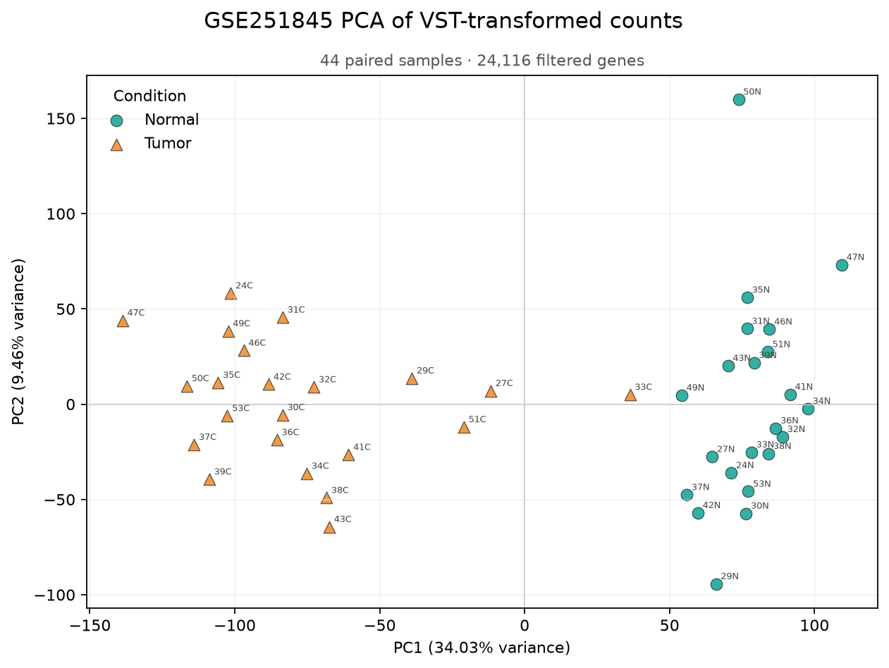
PCA produced by this exercise prompt. It uses 24,116 genes that passed the filter. PC1 explains 34.03% of the variance and PC2 explains 9.46%.
Each point is one tissue sample. Normal and Tumor from the same patient are two separate points. Normal samples cluster on the right of PC1 and Tumor samples on the left, with no overlap between their PC1 ranges. PCA finds axes without using condition labels, so the largest direction of variation corresponds strongly to tumor status. PC1 displays 34.03% of the total expression variation observed among 44 samples on one axis. This is not a causal effect of tumor status or a classification accuracy value.
The left-right direction of PC1 has no fixed biological meaning. If a calculation reverses the sign and places Normal on the left, distances and separation among samples remain the same. What matters is the degree of separation, not which group is on the left.
PC2 is the next-largest direction of variation not shown by PC1 and explains 9.46% of total expression variation. Because PC1 mainly separates conditions here, PC2 makes within-condition sample differences easier to see. 50N lies farther along PC2 than the other Normal samples and deserves review. It may reflect biological individual variation, tissue composition, batch, or quality. Do not declare or remove it as an outlier before checking raw-read quality, library size, and tissue location.
The plot shows both the Tumor-Normal difference and each patient’s original expression characteristics. The paired design that accounts for patient-specific variation is applied in the DEG test, not in PCA.
3-3. Read the DEG result table one row at a time
Section titled “3-3. Read the DEG result table one row at a time”The same run completes the paired DESeq2 test and saves its gene-level results to outputs/GSE251845_tumor_vs_normal_PyDESeq2.csv. PCA shows the global structure of 44 samples; this table quantifies the Tumor-Normal difference for each gene.

Example GSE251845 DEG result table. Click to enlarge the wide table. symbol, entrez_id, and regulation were added later to make the result easier to read.
Each row is one gene. The six core result columns created directly by PyDESeq2 are baseMean, log2FoldChange, lfcSE, stat, pvalue, and padj. Begin with ETV4 in the first row rather than memorizing them all at once.
| Column | ETV4 value | First meaning to read |
|---|---|---|
baseMean | About 1,431 | How much was observed across all analyzed samples? |
log2FoldChange | About 6.23 | In which condition, and by how much, was it higher? |
lfcSE | About 0.29 | How uncertain is the estimated change? |
stat | About 21.67 | How large is the change relative to uncertainty? |
pvalue | About | How strong is the statistical evidence when testing ETV4 alone? |
padj | About | Does evidence remain after testing all genes together? |
ENSG00000175832 in gene_id is an Ensembl ID, and ETV4 is a human-readable gene name. symbol, entrez_id, and regulation are not part of the original PyDESeq2 result. They were added later to make gene names and change directions easier to inspect.
ETV4’s baseMean is about 1,431, the mean observation level after correcting sequencing depth across 44 samples. Its log2FoldChange is about 6.23. Because the comparison is Tumor - Normal, the model estimates ETV4 to be about times higher in Tumor.
lfcSE is about 0.29 and stat is 6.23 ÷ 0.29 ≈ 21.67. The estimated change is about 21.7 standard errors from zero, and padj after testing all genes is also extremely small, about . The direction and statistical evidence for ETV4 increase are strong in this dataset, but this result alone cannot establish that ETV4 causes cancer.
Reading DESeq2 and PyDESeq2 results explains the calculation from baseMean through padj, the distinction between standard error and standard deviation, NaN, and LFC shrinkage.
View the entire table with an MA plot
Section titled “View the entire table with an MA plot”The result table has 24,116 gene rows. An MA plot turns each gene into one point so the whole table fits on one screen. Inspect the overall point shape first, then look for notable genes.
Step 3 prompt: MA plot
Keep the previous analysis and add only an MA plot from the DESeq2 result.

1. Plot one point per gene.
2. Use log10(baseMean + 1) on the x-axis and log2FoldChange on the y-axis.
3. Color genes with padj below 0.05 orange and all others gray.
4. Draw the y=0 reference line and limit the visible range to -5 through 5 so extreme values do not hide the center. Print the number of genes outside the range separately.
5. Save the plot to outputs/ma-plot.png at 160 dpi.
6. Print the number of genes with padj below 0.05 and the counts with positive and negative log2FC.
7. Run uv run python analysis.py and inspect outputs/ma-plot.png. Explain in English the spread at low expression and the meaning of positions above and below zero, then stop.

Do not select candidates by an effect-size threshold or create a volcano plot yet.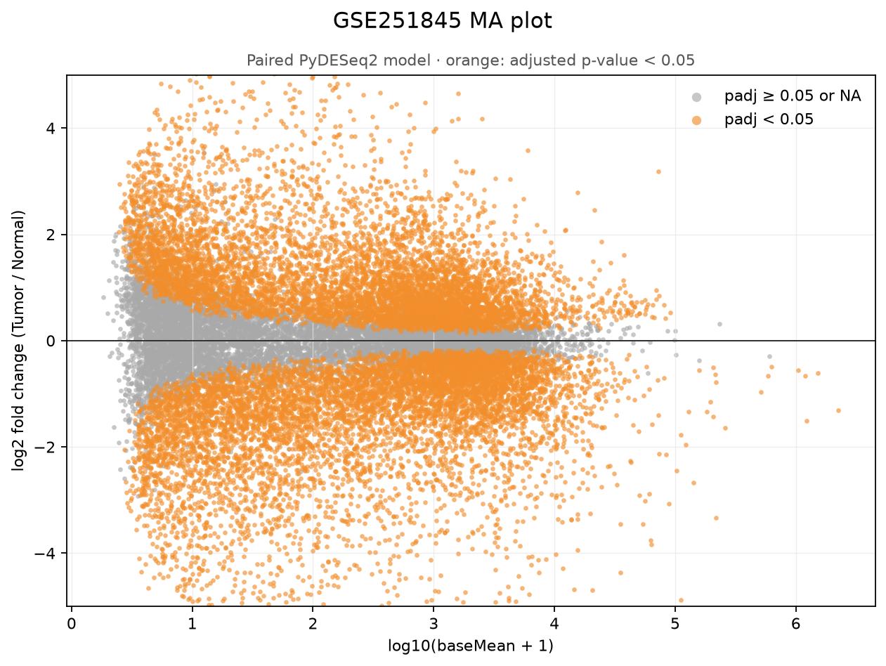
outputs/ma-plot.png from the current experiment. It plots 24,116 genes that passed the filter and shows only -5 through 5 on the vertical axis.
Each point is one gene. The horizontal axis is baseMean, so genes farther right have larger counts overall across the 44 samples. The vertical axis is log2FoldChange. Points above zero are higher in Tumor; points below zero are higher in Normal. log2FoldChange = 1 means Tumor is about twice as high, and -1 means Tumor is about half of Normal.
Why inspect the overall shape first?
Section titled “Why inspect the overall shape first?”The first thing to inspect is not one point at the upper or lower right, but the overall shape formed by all points.
Genes on the left have small counts. A difference of only a few counts can make a large ratio when the original values are small, so points spread widely up and down. Genes on the right have large counts and move less from a difference of a few counts, so they cluster more tightly around zero. A shape wide on the left and narrow on the right, like this plot, is common in count data.
Also check whether points generally appear on both sides of zero. Before selecting individual genes, this step checks whether effect estimates are especially unstable among low-expression genes and whether the entire result is severely biased in one direction.
Then find notable genes
Section titled “Then find notable genes”After checking the shape, read point positions as follows.
| Point position | Simple interpretation |
|---|---|
| Upper right | Count is large overall and higher in Tumor |
| Lower right | Count is large overall and higher in Normal |
| Near zero on the right | Count is large but the Tumor-Normal difference is small |
| Upper or lower left | Change looks large, but the ratio may be unstable because counts are small |
The upper and lower right are therefore useful regions for finding candidates for follow-up. Do not call a gene important solely because it lies there. Orange marks genes with padj < 0.05 after multiple-testing correction. The current result contains 15,099 orange genes: 7,302 increased and 7,797 decreased in Tumor.
Not every orange point has a large change. A small difference repeated consistently across many samples can be statistically significant near zero. Conversely, a point far from zero can be an unstable estimate driven by a few samples. Examine padj, log2FoldChange, and per-sample counts together.
There are 237 genes outside the displayed range of -5 through 5. One is ENSG00000184811, with an apparently enormous log2FoldChange = -27.98, but lfcSE = 216.88 and padj = 0.918. Raw counts are zero in 21 of 44 samples and concentrated in two samples, 50N and 47N, making the estimate extremely unstable. This is a real example of why not to select only points far from zero.
Read an MA plot in this order: (1) inspect the overall point shape, (2) inspect notable points at the upper and lower right, (3) recheck them with padj and per-sample counts. The next volcano plot narrows candidates using effect size and statistical evidence.
3-4. Narrow the candidate range with a volcano plot
Section titled “3-4. Narrow the candidate range with a volcano plot”A volcano plot places effect size and statistical evidence on its two axes instead of mean expression. Use it to narrow candidates for follow-up after checking the global data shape in the MA plot.
Step 4 prompt: volcano plot and DEG candidates
Keep the previous analysis and add only the volcano plot and DEG candidates that pass this exercise's criteria.

1. Use only genes with non-missing padj and log2FoldChange.
2. Use g:Profiler identifier conversion to map Ensembl gene IDs in the results to human gene symbols. If gprofiler-official is missing, install it with uv add gprofiler-official. Save Ensembl IDs and symbols to outputs/ensembl-to-symbol.csv and print the number of unmapped IDs.
3. Preserve the original Ensembl ID as gene_id in the DESeq2 result and add a symbol column. If one Ensembl ID has multiple mappings, print the duplicates for review instead of silently choosing the first. Only in the plot, fall back to the Ensembl ID when a symbol is absent.
4. Use log2FoldChange on the x-axis and -log10(padj) on the y-axis. If padj is zero, cap it at the smallest positive floating-point value to avoid a log error.
5. Color genes red when padj < 0.05 and log2FoldChange >= 1, blue when padj < 0.05 and log2FoldChange <= -1, and gray otherwise.
6. Draw dashed selection thresholds at x=-1, x=1, and y=-log10(0.05).
7. Label only the three genes with the smallest padj in Tumor-up, the three with the smallest padj in Normal-up, and extreme values with abs(log2FoldChange) above 10. Prefer symbols over Ensembl IDs and do not label the same gene twice. Use an Ensembl ID only when no symbol exists.
8. Save the plot to outputs/volcano-plot.png at 160 dpi. Check that labels do not overlap or get clipped outside the figure.
9. Print the total selected candidates, candidates increased in Tumor, and candidates increased in Normal. For the ten smallest padj values in each direction, print both symbol and Ensembl ID.
10. For extreme values with abs(log2FoldChange) above 10, print symbol, Ensembl ID, baseMean, log2FoldChange, lfcSE, padj, and original counts separately to check low-expression instability.
11. Run uv run python analysis.py and inspect outputs/volcano-plot.png. Explain in English the four regions and extreme values, then stop.

Do not present this threshold as a universal biological truth. State that it is the DEG candidate-selection criterion chosen for this exercise.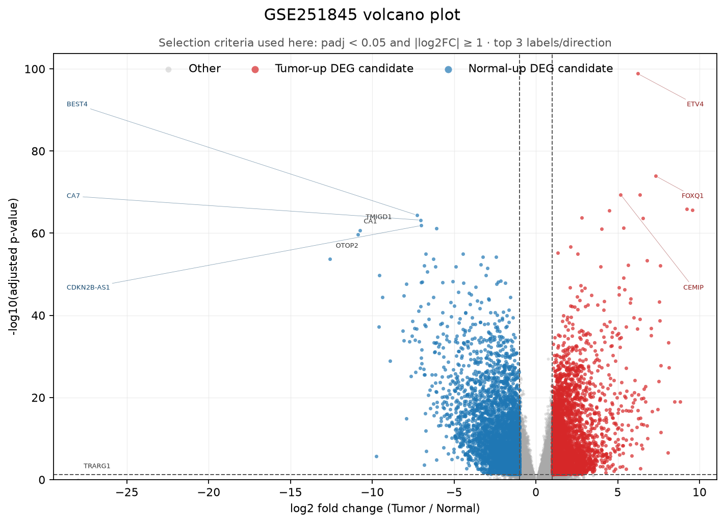
outputs/volcano-plot.png from the current experiment. padj < 0.05 and |log2FoldChange| >= 1 are shown as this exercise’s DEG candidate-selection criteria.
Each point is one gene. Genes on the right are higher in Tumor and genes on the left are higher in Normal. Greater horizontal distance from zero means a larger difference. The vertical axis is -log10(padj), so higher points have smaller padj values and stronger statistical evidence.
Read the regions as follows.
| Position | Meaning in this plot |
|---|---|
| Red points at upper right | DEG candidates at least two-fold higher in Tumor with padj < 0.05 |
| Blue points at upper left | DEG candidates at least two-fold higher in Normal with padj < 0.05 |
| Gray points at upper center | Differences below two-fold that may still be consistent across samples |
| Gray points near the bottom | Differences may look large but lack sufficient statistical evidence |
The vertical dashed lines at -1 and 1 are about two-fold change, and the horizontal line is padj = 0.05. These criteria select 8,256 of 24,116 genes: 3,631 increased in Tumor and 4,625 increased in Normal. Red and blue mean that a point passed this exercise’s threshold, not that it is a confirmed cause of cancer or a good biomarker.
The highest red point at upper right is ETV4 (ENSG00000175832), the row inspected earlier. It meets both criteria, with log2FoldChange = 6.23 and padj about .
Not every horizontally distant point is trustworthy. TRARG1 (ENSG00000184811), the farthest-left point, appears to have a huge log2FoldChange = -27.98 but is gray and low on the vertical axis. padj = 0.918, raw counts are zero in 21 of 44 samples, and values concentrate in two Normal samples, making the estimate unstable.
By contrast, OTOP2, CA1, and TMIGD1, all with |log2FoldChange| > 10, are blue points at upper left. They share large effect sizes, but their lfcSE values are about 0.63 to 0.79 and their padj values are very small. Do not automatically discard or select extreme values. Distinguish them by examining lfcSE, padj, and patient-level counts.
Read a volcano plot in this order: (1) use horizontal distance to inspect effect size, (2) use height to inspect statistical evidence, (3) recheck patient-level counts for candidates passing both criteria. The dashed lines are selection rules that can change with the analysis purpose and cost of follow-up validation.
3-5. Inspect patient-level movement for a top gene
Section titled “3-5. Inspect patient-level movement for a top gene”One DESeq2 row summarizes the difference across 22 patients as one log2FoldChange. Now select the gene with the smallest padj and expand the patient-level values from before that summary. This reveals whether the increase recurs across patients or is pulled by large values from only a few.
Step 5 prompt: paired plot for the top DEG
Keep the previous analysis and add only a patient-level paired plot for the top DEG.

1. Select the gene with the smallest padj as top_gene.
2. Retrieve top_gene from DESeq2 normalized counts and join it with patient and condition from metadata.
3. Use Normal and Tumor on the x-axis and normalized count on the y-axis. Connect the two points from the same patient with a gray line and use different colors for Normal and Tumor points.
4. Include both the gene symbol and Ensembl ID in the plot title and save it to outputs/top-gene-paired.png at 160 dpi.
5. For each patient, calculate Tumor - Normal. Print the number that increased, number that decreased, and patients with the largest and smallest differences. Label those two extreme patients and, if any, patients without an increase in Tumor.
6. Also print baseMean, log2FoldChange, pvalue, and padj for top_gene.
7. Run uv run python analysis.py and inspect outputs/top-gene-paired.png. Explain in English whether line direction recurs across patients and whether any patient is an exception, then stop.

Do not conclude from this plot alone that the gene causes cancer.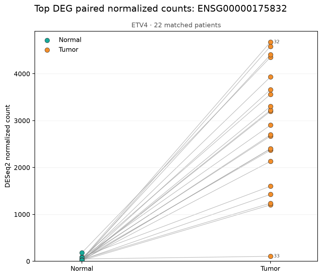
The gene with the smallest padj in the current result is ETV4 (ENSG00000175832). Read the plot as follows.
| Plot element | Meaning |
|---|---|
| Teal point on the left | ETV4 normalized count measured in one patient’s Normal tissue |
| Orange point on the right | ETV4 normalized count measured in the same patient’s Tumor tissue |
| Gray line connecting two points | One patient’s matched Normal-Tumor pair |
| Upward line | ETV4 is higher in Tumor for that patient |
| Downward line | ETV4 is higher in Normal for that patient |
A normalized count is a count corrected for differences in sequencing depth among samples. Following one gray line from left to right shows how much ETV4 changed within one patient.
In this result, all 22 gray lines point upward. Zero patients decreased in Tumor and zero were unchanged. ETV4 increase therefore did not arise from one or two extreme values. It occurred in the same direction in every patient in this dataset.
The magnitude still differs. Patient 32 has the largest difference in normalized counts, about 4,631, while patient 33 has the smallest, about 56. Labels 32 and 33 identify these patients. This is an absolute difference obtained by subtracting two counts, not the multiplicative log2FoldChange.
Normal points look compressed along the bottom not because they are all exactly zero, but because the vertical axis is linear and Tumor values rise to about 4,700. The smaller differences among Normal values become visually compressed. The plot is useful for checking patient-level direction but does not show padj or estimation uncertainty. Use the paired DESeq2 result table for those judgments.
This plot shows consistency of association, not causality. A gene increased in Tumor may have helped cause the cancer, increased as a consequence of cancer, or reflected a difference in tissue cell composition. When mapping IDs to gene names, also pin the genome-annotation version used in the analysis.
4. Questions to answer after inspecting all plots
Section titled “4. Questions to answer after inspecting all plots”- Why use
~ patient + conditionrather thandesign = ~ condition? - Why does interpretation remain the same if left and right on PC1 are reversed?
- Why does fold change spread more widely in the low-expression region of an MA plot?
- What does a gene with small
padjbut smalllog2FoldChangemean? - Why can you not immediately call a top DEG a cause of cancer even when it recurs across patients?
The next task is to stop reading candidates one at a time and group them by shared functions and pathways. LOCRC Exercise 2: Finding Functions and Pathways with GO and GSEA uses the DEG lists and complete gene ranking produced here as new inputs.